
“We already have a brand color. Can we just send the code?”
Send it. It's useful. But for jewelry packaging color consistency, put the code beside the actual buying question: which parts of the finished set are meant to look alike? Approve the physical materials together, give the accepted pieces identifiers, and carry those references into the next order. That gives the supplier something to reproduce beyond the word “pink.”
The questions below are illustrative buyer prompts, not a transcript of a BRT Pak customer project. The question in each case is straightforward: would you release this set for the order? No production tolerance, laboratory result, minimum order or delivery date is being promised.
What does “the same pink” mean in the finished set?
“Are we accepting a mismatch before we have even ordered?”
Only if the requirement was a match. Decide that first.
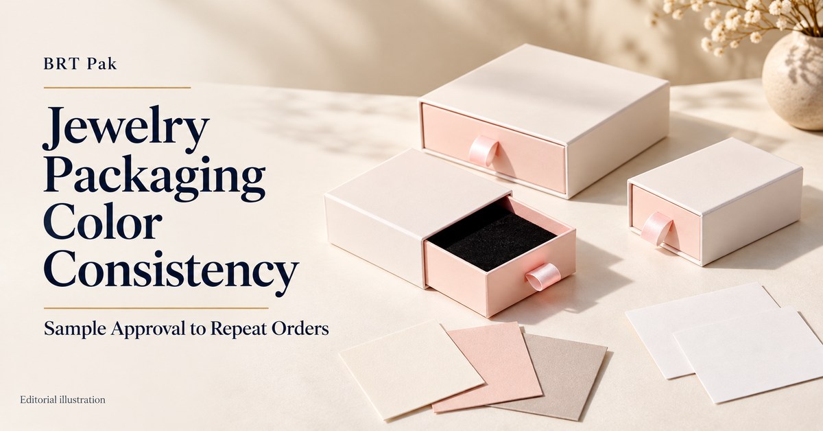
A printed card and the paper wrapped around a box might be intended as a close pair. A woven ribbon could be a darker accent. The pouch may belong to the same color family without pretending to be paper. Those are different buying decisions, even if the artwork started with one swatch. Write “close visual match” where that is the intention and “darker accent” where it isn't.
There's nothing wrong with wanting the ribbon and box to match closely. There is a problem with leaving the supplier to discover that expectation after samples arrive. Think about an ivory sleeve, blush drawer and black lining. The lining is plainly a contrast; the relationship between the ribbon and drawer is less obvious. Either a close match or a coordinated difference could work, provided that choice belongs to the brand.
“The pouch looks right alone. Beside the box, it looks wrong.”
That's why the set belongs in the review. A decision made on the pouch alone says very little about the relationship you've just noticed.
A set can give a different impression simply because someone has moved the card. If the card belongs inside the box, an approval photo with it beside the pouch is showing another layout. I'd review the assembled box with the jewelry loaded wherever it affects the visible presentation, and the ribbon already attached.
“Make it lighter” could take this design in the wrong direction. A pouch intended as an accent might need a more obvious difference from the box; one intended as a close match needs less difference. The note to the supplier should say which result you're after and identify the two accepted references. That is a more useful revision request than “improve the pink.”
This review deserves particular care when new stock will sit beside an older delivery, or several collections are displayed together. A one-off purchase from ready-made options may need less administration. The comparison your business will actually make should determine the approval work, rather than an automatic demand for the tightest available match.
Can photographs settle jewelry packaging color consistency?
“They look close enough in the supplier's photos. Why send samples?”
I'd use the photographs to narrow the options, not to release a repeat-order program. The image might show that a component is obviously unsuitable. Choosing between two close shades is another task, and the buyer needs the physical material for that decision.
Imagine accepting a pouch because of a picture, then disagreeing when the mailed piece arrives. Which one has been approved? The camera, lighting and display have all participated in the first impression. The emailed picture is still an image of the pouch, not a physical shade reference, however useful it is for identifying the piece under discussion.
“Can we use the photo to explain what needs changing?”
Yes. Mark the component and explain the comparison. A photograph saying “this ribbon looks too bright beside this drawer” is much more helpful than an unlabelled image followed by “not approved.” Keep the physical references involved when a close shade decision is needed. The photo identifies the concern; it doesn't remove the effects of capture and display conditions.
There's a timing benefit here too. Images can help narrow the material direction before detailed samples are made. Once an option looks promising, obtain a representative sample and find out what processing remains. An unfinished sheet is a useful development reference, but adding a finish later may change the appearance you thought you had approved.
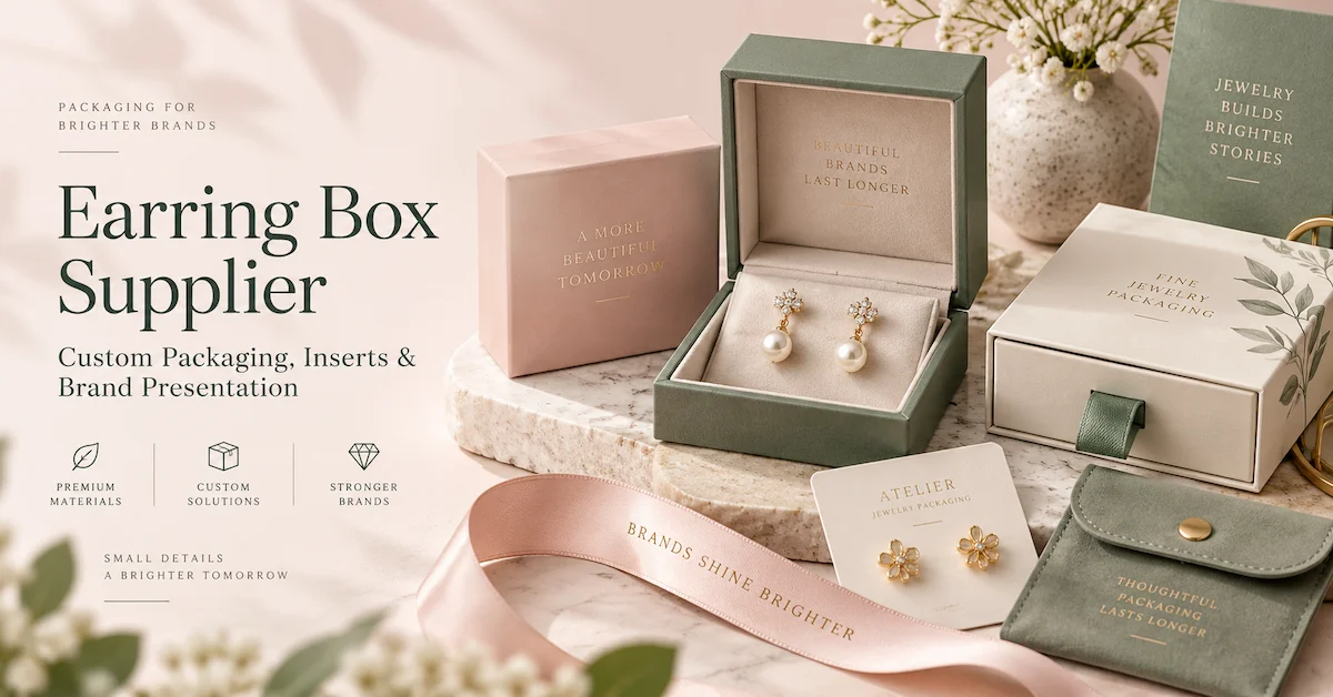
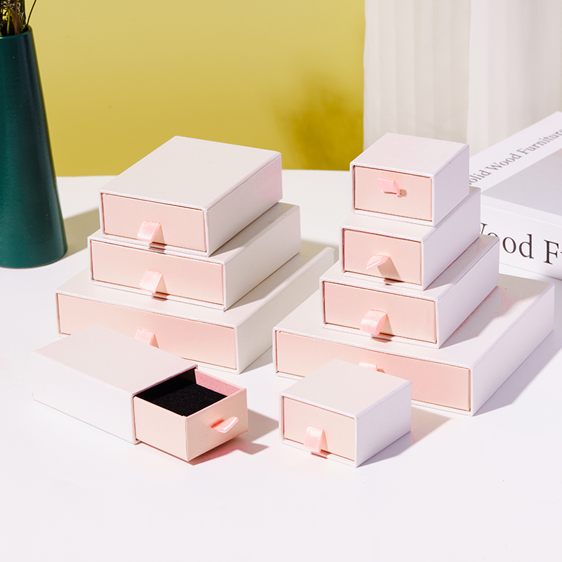
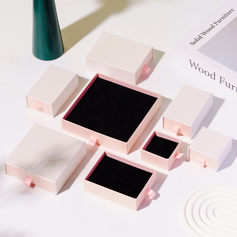
BRT's paper jewelry box listing shows pink and white drawer-style examples with matte paper, satin ribbon and black velvet lining. Those are identifiable components for a discussion. The public listing doesn't establish your custom material grade, acceptance limit, quantity or production timing. The photographs below are catalogue references, not measurements of a color standard.
Why can one color code produce several appearances?
“The paper is right. Can't the fabric just be adjusted to match?”
It may be possible to develop a closer relationship, but adjusting artwork is not the answer to every material difference. Printed paper, dyed fabric and a purchased ribbon obtain their appearance through different routes. Sometimes another material or an intentional contrast is the more practical proposal. Have those options visible before committing to a shade the selected construction cannot comfortably express.
The paper proof may be convincing, yet it answers only the paper question. Coated and uncoated stocks can show the same nominal printed color differently; texture adds another surface effect. A piled pouch may look different when turned, while foil brings reflected surroundings into the comparison. I wouldn't expect one good-looking paper sample to approve those other surfaces on the buyer's behalf.
“But the color is right. It just looks shinier.”
A complaint that the ribbon is “too light” might concern its satin reflection beside matte paper. I'd separate that from a shade correction before commissioning another sample. The pull tab could be a deliberate bright accent; if that was never the design intention, a finish discussion belongs in the revision request.
The review needs the surface after its relevant finishing steps. An approved raw sheet is not proof of the appearance after printing, coating or covering. It may still be a good starting point. Its approval simply needs to say which decision it settles and which remains open. That is easier than arguing at delivery about whether the final process was understood.
X-Rite's “CPG Color Accuracy and Consistency” discusses the uncomfortable situation where suppliers satisfy individual tolerances but the packaging parts still look wrong together. Its account also covers material, process and ink differences. It is a useful reference for the assembled review: https://www.xrite.com/blog/cpg-color-accuracy-consistency.
Would the coordinated set serve the collection? If so, that can be the approved design rather than an apology for a failed match. If not, name the surfaces needing closer development. Either choice also needs a sourcing route that can support the order and its replenishment.
What should the physical approval record contain?
“Could we approve the complete set and let the supplier keep it?”
Keep a reference too. Give each approved piece an identifier, including its material and finish. Both sides need to know which physical item governs the next order. A photograph identifying the approved arrangement is useful alongside those references; it doesn't replace them.
The administrative detail matters to jewelry packaging color consistency. Which pouch does “approved” mean? If two samples carry that description, the reorder needs a better instruction. Write the project and revision on its label; add the component and the date of approval. Both desks should have a named reference. Otherwise you're discussing a shade before you've established whether you're holding the same approved version.
“Can the ribbon just use the box's reference?”
Use the ribbon you've accepted with the box. Keep both references in the approval pack; the paper cannot stand in for the ribbon's surface. The exterior, ribbon and pouch have different surfaces. A branding sample may govern the mark while a drawing governs its position. This table shows the information to complete for your project, not test results or already qualified materials.
| Part of the set | Specification to carry forward | Physical reference | What the review must resolve |
|---|---|---|---|
| Box exterior | Paper or cover description, finish and color relationship | Finished approved exterior | Shade across visible panels, texture and sheen |
| Pouch | Is there a pile? Which way faces out? | This is the pouch we accepted with the box | Put it beside the drawer: is that the shade relationship you wanted? |
| Ribbon | Which ribbon are we ordering, including width and finish? | Leave that ribbon on the approved sample | Is this an accent or a close match? |
| Card | Stock, artwork revision and surface finish | Approved printed card | Print appearance and relationship to adjacent components |
| Brand mark | What size mark, where, and how will it be applied? | The approved mark, on the cover being ordered | Check this size on this cover; accept the decoration separately |
| Lining or insert | Material, visible color and arrangement | Approved fitted component | Jewelry presentation and its relationship to the exterior |
“The card goes here” belongs in the record as much as its stock description does. A photo of the accepted layout helps someone new reassemble it, including how much ribbon is visible and what the card covers. I'd retain that photo with the material masters. It governs the arrangement, while the physical pieces govern the close shade comparison.
Keep the samples clean and protected, out of needless light. You'll want them in usable condition for the reorder. A pink swatch without a name gives the next buyer a guessing job. An unmarked swatch leaves that person guessing. Attach the decision to the order file. Somebody arranging replenishment ought to find it there, rather than chasing the people who attended the sample review.
Start with the paper box construction
Review the drawer-style paper box and identify the exterior, ribbon and lining requirements to include in your color approval brief.
Explore the Paper Jewelry Box →Which reference wins if the file and sample disagree?
“Our design file looks lighter than the mailed box. Is that a rejection?”
It depends on what governs final appearance. Set the hierarchy before production. I'd return to the physical master for shade, the drawing for placement, and the written finish requirement for that decision. Give them those jobs explicitly. A supplier given both needs to know the final appearance target. “Use the mailed master for finished shade” is a workable decision if that is your intent; using the file instead is another choice.
A designer may know precisely which Pantone reference is in use. The supplier can't infer that from a number detached from its guide or material context. Send the complete identification with the physical reference you're using; give the pouch and foil their own approval rather than treating printed paper as the answer for every surface.
“Marketing likes one sample and purchasing prefers the other. Who decides?”
Name one approval owner. Let marketing comment on the appearance and purchasing explain the sourcing constraints. Then send one instruction the supplier can act on. Is the closer match worth buying a special material, or would the stock option serve the launch? Keep those two proposals visible until the owner makes that choice. The supplier cannot choose between two instructions that point in opposite directions.
The approved box can be named as the shade reference in your jewelry packaging color consistency brief. The drawing still covers placement. Could someone new to the project find the right reference without calling its original buyer? That's the test for the file.
How should the light and measuring method be agreed?
“Our office and shop lights give different impressions. Which one wins?”
I'd review the intended customer lighting as well as the office sample light, and agree which conditions will govern acceptance. A change in appearance under different light can matter even when everyone liked the sample in the office. Two materials looking alike under one light and different under another is the practical issue described by metamerism.
There's no need to invent a universal lighting rule for the whole industry. This order needs an understood approval method. Keep the comparison background and arrangement consistent, identify the governing samples, and include the lights relevant to the presentation. An approval made under one desk lamp and a rejection based only on a phone photograph elsewhere are difficult to reconcile.
“Could a Delta E limit take the judgment out of it?”
It can support the check; it can't carry the whole appearance decision. A Delta E value describes a difference under specified measurement conditions. The formula, settings and material matter. A limit copied from another paper project doesn't become an appropriate guarantee for fabric, foil or a new finish just because the number is precise.
If instrument checks are included, the record needs the equipment and relevant settings: geometry, illuminant and observer, measurement area, backing, orientation, formula and any conditioning required. The sampling points also need to represent the surface being bought. One reading on a convenient smooth patch may tell you little about the rest of a textured or directional material.
I would look at suitable samples before agreeing the acceptance limit. Which differences would this brand accept? Which would it reject? That makes the proposed rule answer a real commercial requirement. Where visual and instrument results disagree, a review route is needed rather than an assumption that either an informal opinion or a meter always settles the purchase.
X-Rite's visual and instrumental quality-control guidance supports using visual review alongside measured information when setting and applying tolerances. Retain the appearance reference and the method supporting the decision. Source: X-Rite, “Visual and Instrumental Quality Control,” https://www.xrite.com/page/visual-instrument-quality-control.
Turn your brand color into an approval brief
Send your box, pouch, card and logo requirements, the physical references available, and the lighting conditions that matter to your presentation. Ask BRT to confirm a practical sampling route and quote assumptions.
Request a Color-Matching Packaging Review →Does approving a swatch release the whole box?
“We like this paper. Can production start?”
Only for the scope you've actually approved. A swatch helps choose the exterior material and color.It doesn't show how the finished box closes, how its logo reads, or how the ribbon looks in position. If those decisions are still pending, say so. “Paper approved; assembled sample pending” is a clearer instruction than “approved” on its own.
The development sequence can be practical without skipping the distinctions. Screen material options first. Review branding on the intended finished surface next. Then look at the assembled presentation. Each sample has a job. Calling the earliest one a production approval makes it carry decisions it hasn't demonstrated.
“The supplier used a temporary lining. Is the sample useless?”
No. The paper may be ready for a decision even though the lining isn't. Mark the temporary lining as pending; don't let the box approval silently accept it. If a sample uses another material source or omits a final process, label that difference as well. Release the decision that is ready, and leave the others open until the right sample arrives.
Material options should also have a realistic supply route for your intended order. A beautiful swatch is a distraction if nobody has established whether it is a stock choice, a special purchase or custom color development. Those routes affect minimum quantities and replenishment. They belong in the quotation while the appearance is still being selected.
The jewelry box logo printing options need review on the selected construction. A foil choice shown separately may look different beside pale paper. A recessed mark creates shadow. A printed logo needs its intended size and location. The accepted exterior shade does not automatically approve how the branding changes that surface.
Write the jewelry packaging sample approval note as permission: which version may proceed, which pieces remain pending, and what exceptions apply? If reviewers disagree about darkening the ribbon, choose before sending the note.
We're buying from several firms. Who takes responsibility for jewelry packaging color consistency?
“Our box and pouch come from different companies. Is that a problem?”
One person needs to approve the combined result. Both suppliers might deliver their accepted pieces and leave that final choice open. Whose name goes beside “set approved”? Put that name on the brief before releasing the separate orders.
Does the quotation cover cross-material packaging color matching, with the pieces reviewed together, or are you paying only for separate samples? You may only need the component samples if your own team will review the set. If one supplier is combining them, find out who signs off the set.
“Must the supplier disclose every outside partner?”
You need an accountable specification and change route, not unnecessary commercially sensitive detail. Where components are purchased from partners, the coordinating supplier should explain how the approved requirement reaches them and how a proposed replacement reaches you. A responsibility that stops at the purchasing handoff leaves the brand to discover changes later.
Send the same current reference pack to everyone involved. A box made to revision B and a pouch made to revision A can each comply with its instructions while failing the assembled design. Don't let the old artwork or reference remain an active option after a revision. That small discipline saves a much larger discussion about who followed the wrong pink.
A change in one component may also reopen the relationship with another. A warmer replacement pouch can make an unchanged card look wrong. Review the set where that relationship matters. Leaving the card untouched doesn't necessarily leave its appearance within the set unchanged.
The substitute is almost identical. Do we really need a review?
“The original ribbon is unavailable. This one has the same description.”
Put the replacement into the set. It's a quick review now. Waiting until the boxes are finished takes away choices you still have at this point. You can agree to replace the ribbon without having accepted the new one yet. What has changed? Set the proposed piece beside your retained references and decide from that comparison.
Are you changing the design, or has the supplier run out of its material? A redesign asks for a new appearance. The substitute needs to meet the existing requirement or disclose the difference for acceptance. “Updated material” is too vague to explain which of those jobs has been done.
“We can accept it for this launch. What happens on the next order?”
Say whether the acceptance is temporary. In an illustrative replenishment situation, revision A might cover a blush box, coordinating pouch and cream card. A replacement pouch could look acceptable under the general condition but warmer under the intended display light. The buyer can develop another option, change the approved relationship or accept a limited exception. None needs to be called an exact repeat.
| Change proposed | Why appearance may move | Evidence for the decision | What to record |
|---|---|---|---|
| New cover source | Shade, texture or finishing behavior differs | Finished comparison beside the master | Approved equivalent or new revision |
| Matte replaces gloss | Reflection and perceived depth change | Sample after final finishing | Accepted finish and revised reference |
| Different pouch material | Surface direction and light response change | Pouch reviewed with the set | Accepted relationship and affected orders |
| Foil replaces printed logo | The mark reflects differently | Branding on the intended surface | Separate decoration approval |
| Wider acceptance limit | More variation becomes permissible | Proposed rule and boundary examples | Buyer decision and governing method |
An exception could read: “Replacement pouch accepted for this order only.” Add the affected quantity, reason and approval owner. If it is the new permanent requirement, create a revision instead. Label stock for the warehouse; don't leave staff to separate collections by recognizing a slightly different pink.
Bring commercial effects into the same discussion. The proposed replacement may change cost, minimum material commitments or timing. Does the agreement say who owns unused original material and how it will be dealt with? Settle that expense with the revision, before signing for the new sample.
A change can serve jewelry packaging color consistency if it becomes the new reference deliberately. It just needs to become a decision the next order can retrieve. “We let them use something close once” is a difficult instruction to repeat. An identified exception or a new master is much clearer.
How will the next buyer know what “same as last time” means?
“Does the previous purchase-order number tell the new buyer enough?”
Include it. Then attach the specification you expect this delivery to follow. Physical-reference identifiers, artwork revision, material, finish and the change rule should travel with the purchase request. Otherwise the number has to carry every decision from the original development. That becomes fragile when another person handles replenishment or a material source has changed.
The response should flag proposed changes before production. You might accept another cover or ribbon after review. You might not. Finding out at receiving takes away choices that were available during planning. The point is not to forbid every alternative; it is to preserve the buyer's ability to approve the effect on the set.
“What records do we need if a delivered batch looks different?”
If a pouch looks warmer at unpacking, what can the supplier trace? The record should connect the carton and shipment with the production lot, retained sample and relevant material lots where available. It needs to work across your planned deliveries. If a pouch looks different, can the supplier find the lot and the sample kept from it? That's the useful question. There is little value in adding unrelated detail to that trail.
The approved sample shows the target. It doesn't demonstrate that the whole run achieved it. When will checks happen, and which units will be selected? Put those answers in the plan. Checking near the start gives you a chance to catch a setup concern. Check later too, if you're trying to find variation through the run or between component lots. Who stops or reviews the affected work if a check fails? Agree that before the result arrives.
At receiving, retain the identities of the items checked. If a concern appears, isolate the affected stock while its extent is investigated. Report the component, lot, reference and viewing conditions. Unlabelled pictures with “the color is wrong” make the supplier reconstruct the problem before it can investigate the cause.
Retained production samples help compare the shipment with what was made, and the physical master helps compare it with what was approved. Storage or handling may enter the investigation too. Keep those possibilities attached to real references and conditions rather than assuming every difference originates in the latest production step.
Repeat orders turn jewelry packaging color consistency into an ongoing purchasing job. That is why repeat-order packaging consistency belongs in supplier selection. The attractive first sample matters. So do reference retention, change communication and lot identification: the things that let the approved proposal survive the next purchase.
What are we paying for when a closer match costs more?
“A stock ribbon coordinates well. Is custom development worth it?”
Maybe. Does the design need the closer match? A special color route may add sampling or material commitments. A coordinated stock combination may already give the presentation you want. Show the stock ribbon and the developed option side by side, with their sourcing and reorder terms attached. Would the extra development solve something the customer will notice, or something your brief never required?
In this jewelry packaging color consistency decision, I would spend on the appearance the design needs and keep the approval work that protects it. A carefully selected stock set still deserves identified references and a change route. Custom development still needs practical supply and schedule terms. Either can become a poor purchase if the buyer leaves those terms unstated.
“The finished-set MOQ is small. Why is there an extra material charge?”
A finished quantity and a material commitment can be different. Separate the minimum set quantity, quantity per color, minimum material purchase and process requirements. Does this order pay for more material than its sets use? If the remainder is reserved for later purchases, get the ownership and storage terms on the quote. “Expected repeat demand” shouldn't quietly become your commitment to buy it.
When does the quoted lead time actually start? Check whether development is included. A schedule starting after approval isn't directly comparable with one that includes the samples. Put the reference delivery, material selection and sample rounds on the schedule. Then add buyer review, any revisions, production allocation, inspection and shipment. If approval slips, or another material needs sampling, work out which dates have to move. A headline date detached from those assumptions is hard to assess.
Capacity and material availability are separate. A general statement about production capacity doesn't establish availability of the chosen cover or decoration process. Share the replenishment forecast, then have the supplier schedule this construction and these quantities. The general capacity figure cannot do that job.
For the custom jewelry packaging cost comparison, put sampling, special material purchases and decoration setup on the sheet. Include the checks and freight each quote covers. Two sensible proposals can have different prices because they contain different jobs. Leave alternatives visible. A saving that drops the card or changes the material should be a choice on the quote, so you can judge the resulting pack before buying it.
What should a supplier comparison and RFQ actually show?
“One quote is cheaper. How do we know whether it covers the same job?”
Give candidates the same set, quantities, references and approval expectations. Then compare their routes. A component-only quotation and a coordinated-set quotation aren't automatically competing prices. Leave “stock color” and “developed color” on the two proposals.
| Buying route | What the proposal should explain | Main tradeoff | Useful setting |
|---|---|---|---|
| Coordinated stock colors | Available references and future sourcing | Less development, less freedom over exact shade | A set whose appearance works with existing options |
| Custom color development | Material minimums, sampling and acceptance conditions | Closer target with added development commitments | A brand requirement that justifies the extra work |
| One coordinating supplier | Responsibilities for the complete set | A single route still needs clear partner controls | A buyer seeking accountable set coordination |
| Buyer coordinates suppliers | Reference distribution and assembled approval | More sourcing control, more administration | A team able to manage cross-supplier decisions |
I would rather hear “Do you want this ribbon to disappear against the drawer?” than get a quick yes that means the wrong thing. The lining could be a stock contrast too, if you approve it. Read the route being proposed; the questions tell you which decisions are still open.
“Which evidence would answer our color question?”
Relevant photographs, material identification, sample records and proposed checks. If an inspection record is available, tie its checked items to the proposed set. For any certificate, I'd verify its current validity and scope. The product and requirement on a lab report must be relevant to the claim. A document about something else doesn't explain why this packaging should pass. Request evidence that answers this purchase.
For jewelry packaging quality control, finish the conversation: “Suppose the pouch fails this check. Who holds it, who proposes the fix, and do you need our signature to use it?” A list of checks leaves that buying decision unanswered.
“Then what should we send with the first inquiry?”
A useful RFQ opening could be: “We want to price this set, with the component dimensions and artwork attached.” Follow it with the planned quantity, destination and the date you need to work toward. Add the color code and the physical references available. Say which pieces should match and which are accents.Will a customer see the complete set together, perhaps beside packaging from a previous delivery? Explain that comparison. Say “fixed” beside the choices already made, and show where you'd consider an alternative.
The private label jewelry packaging brief can say “produce to these references” or “show us material options for this design.” Those are different jobs. The first needs accurate controlled instructions. The second needs options and a route to approval. Deliverables, sample ownership, artwork versions and responsibility for decisions belong in either discussion.
The company named on BRT Pak's site is Jinhua Better Industrial Co., Ltd., in Jinhua, Zhejiang, China. The workflow published there runs from design and material selection through prototypes and sample confirmation to logistics. The company information and product collection help identify a starting construction. Project-specific evidence and commercial terms need to follow from the inquiry and approved samples.
An RFQ to a custom jewelry packaging supplier should keep the whole purchase visible. If color matching jewelry boxes also involves your pouch and ribbon, include them, along with the lining and card. “Quote this set, and show a coordinated alternative if these materials will not match” is a specific request. Have the reply include sample work, approval terms, minimums and its schedule assumptions.
Send a complete packaging inquiry
Send the packaging pieces, quantities and destination with your brand references and decoration files. State your intended timing, then have the quotation describe its samples, approval route and commercial terms.
Request a Custom Jewelry Packaging Quote →Compare the complete set quotations
Put one reference arrangement behind the quotations, with one approval brief. Then read what each quotation includes.
Open the Packaging RFQ Guide →Ten practical questions about jewelry packaging color consistency
1. Can the digital code be our only color reference?
Send it as a starting target, but keep physical references for the finished surfaces. Paper, fabric and decoration can look different despite one nominal code. Identify what governs if the file and sample disagree, and agree the method used to check production. You still need to decide how the actual pieces look together.
2. Should we approve the pouch as a warmer accent?
You might accept the warmer pouch deliberately. Keep it beside the box as a paired reference and write down the relationship. If the design needs a closer match instead, leave approval open while that option is developed. An approved pouch beside an approved box, with the relationship described, is more useful than writing “both pink” on the order.
3. What Delta E limit should we request?
One suited to the material, measurement conditions, formula and accepted samples. Don't adopt a universal number. Work through the method with the supplier and include visual approval plus a route for disagreement. A numeric limit does not settle gloss, texture, direction or the presentation of the complete set.
4. How do we check fabric with a directional pile?
Agree the orientation and examine it as used in the set. Turning the material can change its apparent shade. Review that behavior under relevant lights. If turning the fabric gives an appearance you dislike, change the material or the relationship you're approving. An inspector shouldn't have to choose an angle that disguises it.
5. We signed the paper swatch. What may the supplier produce?
It approves the job assigned to that swatch. The exterior may be settled while the logo, lining, ribbon and assembled construction remain pending. Record that scope and make production permission explicit. A development direction should not become a complete-set approval just because the email uses the word “approved.”
6. Why approve the logo separately?
Approve a branded piece made with the intended process. A foil mark and a recessed mark don't show the same thing; position and size matter as well as the paper behind them. A mark shown separately may look different beside the finished cover. Sign for the background and the branding separately if they are at different stages of approval.
7. The original material can't be sourced. What do we approve instead?
Review the proposed replacement against the references and set before production. Record permanent acceptance or a one-order exception. Include effects on minimums, cost and timing. A material with a similar description may be sensible, but the description itself isn't approval of how that replacement looks in your packaging.
8. Could stock colors reduce our order minimum?
It may be possible. Price the actual stock-material option before deciding. Have the supplier separate the set quantity, quantity per color, material commitment and any process minimum. If you'll be reordering, find out whether the selected stock material can support that plan as well as the first order. Let the quotation show those commitments; one low set minimum doesn't answer all of them.
9. What should accompany a repeat purchase order?
Current specification, physical-reference identifiers, artwork revision, material and finish instructions, plus the change rule. Use the previous order number where it supports traceability. Have the response disclose changes and shipment identification. “Same as last time” depends too heavily on who happens to remember the original project.
10. What does BRT need for a useful color quotation?
The components, dimensions, quantities, destination, timing, artwork and references available. Explain what must match, what may coordinate, and any older stock the new order must sit beside. Request sampling scope, approval conditions, minimums and schedule assumptions. That prices a recognizable packaging job rather than “everything pink.”
Conclusion
Can the next buyer pick up the approved set and place an informed reorder? That's the practical test for jewelry packaging color consistency. Keep the references and the order instructions together. Say what needs your approval if a material changes. Send the components and brand references to BRT Pak when you are ready to discuss samples and a quotation for that packaging job.
Plan your next packaging order
Share the packaging set and the color issue you need to solve, and request a project-specific proposal.
Discuss My Packaging Project →